An Essay to discuss on the architecture of Robert Venturi: The position of Sainsbury Wing
Essay_Architectural History and Critism
The Sainsbury Wing stands in between the invention and replication as a contemporary building in both interior and exterior way. Here, the term “Invention” defines as the method of architectural design and the “Replication” means the direct copy of architectural elements for the building form. I argue that Robert Venturi falls into the idea of using old and new architectural features without creating logical relationship, thus blurring the position for this building. Indeed, a museum should exercise its honesty to present the art display and give a neutral space for visitors to reflect the truth of art, rather than imitation.
The taste of architecture: The rationally of new and old elements
Firstly, here comes with the discrepancy between Venturi’s thinking and reflections from general public. His standpoint is to capture the neo-classical ornaments as the signifier, like sculptured cornice and columns, to make people associating it as an art museum. He claims that the idea of “rendition classicism” symbolizes its position as a scarce place for celebration. [1] At the same time, he wants to show that this building fashions in a post-modern (Break of traditional rules with inclusion of different elements) way. So, his mindset is to express the “Contradiction and Complexity”, his invention for building design. His idea wants to mix old and new architectural elements together for the envelope; from the visitor’s perspective, it is a building with over-dressed facade. Some visitors criticize that it looks like a post office rather than a post-modern design. [2] “Venturi is not an architect but is an exterior decorator.” [3]
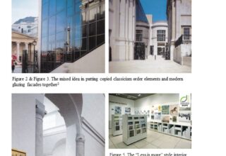
Indeed, there is no rationality in placing those old and new architectural elements together for the exterior. For instance, by replicating the neoclassicism limestones, the material used in the existing National Gallery, this makes the new Sainsbury Wing dressing as a Renaissance Museum. (Refer to Fig. 1). The only difference to distinguish the existing and new gallery is that by designing the modern Mies van der Rohe-style curtain wall for the open staircase next to the Jubilee Walk (Refer to Fig. 2). This is to show that the new Sainsbury Wing is built in modern era of 1990s. I suggest the building makes the public confused because of the vague boundary between old and new. For example, the reflected curtain wall located close to open staircase (Refer to Fig. 3) is to mirror the existing gallery to express the continuity of classicism [4]. But is it really the extension towards classicism? This mirrored image can have various interpretations such as the transparency of building, the acceptance of new ideas, or just to increase the optimum light intensity for the circulation. So, I respect his terminology towards its design strategy, the idea of treating cornices and ornaments as a plug-in to the building, but turns out to be superficial from the perspective of visitors.
The meaning of art museum: A medium for visitor to reflect, not to be stereotyped
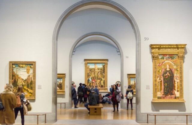
Secondly, the make-up of museum facade itself can not reflect the truth of art display itself, but should allow the art to speak for themselves. So, I suggest that Venturi falls into the idea of replicating old elements to stereotype classical art as elegant and old fashion. From the interior of the new Sainsbury Wing, the exaggerated spatial-to-human scale in the art display areas on 2/F (Refer to Fig. 4) gives visitors a great manifestation of appreciating renaissance paintings. On top of it, I suggest that such classical skirting and columns are making the classical art to be stereotyped, confining visitors’ thinking towards art. The arch-shaped beams and cornice (Refer to Fig. 4) drives people to think Renaissance art as high-end commodity in auction venue. On the other hand, the gallery shop at ground floor (Refer to Fig. 5) is displaying art in a contemporary way because of its truthful approach. The simplicity of shelf display design and use of white stucco on wall finishes are not distracting people from the environment, but to focus on the essence of drawings behind.
Art has its uniqueness and can be interpreted differently. A dancer (The art display) has its own character to express the dance move (The idea/thinking behind art); the costume (The building façade) is a clothing to harmonize the dance move, not to imitate and overtake the dancer. For a museum, its architectural expression should be simple and clear as an unprejudiced medium for displaying objects, but to allow diversified ideas towards art, not to speak for the art.
The discussion of spatial quality: Merits and Demerits
In terms of spatial quality, the Sainsbury Wing partially functions well in space planning, together with indoor and outdoor space. The pros of the design is the open stairway that can allow visitors to travel between gallery spaces and the outdoor public space. Also, the rectangular-oriented gallery spaces on 2/F accommodate much paintings in high efficiency (Refer to Fig. 6). However, I would have criticism towards the overall spatial arrangement for the building.
The Demerits for Art Gallery space: Form hinders circulation
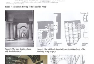
By referring to the sectional drawing (Refer to Fig. 7), the two exhibition floors are separated so that it makes visitors confused and they have to walk frequently between two floors. The staffs are difficult to transport those dedicated drawings in between two floors. So, I suggest those two floors should be closely located. For the interior space in the 2/F art gallery, the faking double-column with huge classical architraves with cornices are purely for aesthetic purposes (Refer to Fig. 8). This ornament-driven interior design makes people to think that art is conservative, high-end and stereotyped, as well as hindering the circulation path to each visit zone. On top of it, its regular visiting path inside the 2/F Art gallery lacks excitement. At present, those paintings are packed firmly chronologically in each consecutive room (Refer to Fig. 9). What if a journey of art exhibition can be explorative? By designing zig-zag/ meandering paths or an open-plan approach for art exhibitions, it can be a new way to respond to the idea of post-modernism, the breaking of traditional rules.
The meaningless decoration? Or the truth of material?
From the construction detailing of the museum, several parts of the architectural elements are over-dressed and not reflecting the truth of the material itself. For example, the metal eaves (Refer to Fig. 10) on the grand staircase above make people confused. It is a structural member for beam support but it is not necessary to design with circle-craved pattern to confuse visitors. In addition, the arrangement of the metal eaves cannot express its structural consistency as they are not aligned to the windows (Refer to Fig. 10) and they are in random placement, showing disrespectful towards the building structure. The material should be presented its structural beauty instead of elegant decoration.
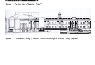
Another example is the design of the Iron Gate that located close to the museum entrance (Refer to Fig. 11). Its noble-shaped scepter that represent the prestigious status of the building. But is it necessary to turn classical art into high-end culture? Another example is the roof design of the museum. To contrast with the camouflaged limestone cladding, he builds a slanted roof with attic glazing in classical mullions (Refer to Fig. 12) as decoration, with contrast to the traditional pitched roof from the surrounding. I understand that from his invention of thinking, he only works with existing forms in sudden combinations but not to explore new forms. [5] Indeed, his methodology falls into the trap of form imitation, the over-use of classical columns and cornice, as he wants to show off the dazzling days of Renaissance, thus making the building becoming repetitive. Such complexity creates misunderstanding of its position and diminishes its vernacular culture.
Conclusion: The blurred position needs to be redefined
The identity, being a contemporary art museum, of the Sainsbury Wing is blurred as it should be more relevant to the content of art itself rather than the building skin. Undoubtedly, it has an invention that combines old and new architectural elements together, but at the same time, it falls into the trap of Eclecticism (Abstract geometry and borrow elements from diverse historical periods). In clear words, it captures the precedent ideas but without developing own design strategy to make it convincing to the public. So, there is a criticism by public that the façade of Sainsbury Wing is “decorated” with classical items without expressing the soul itself.
Indeed, a museum should be designed in a pure form and give freedom for visitors to rethinking the truth of art. His intention to revive classicism elements to capture the precedent ideas is not wrong, but the key idea is to use it with reasoning in building function instead of replication. A contemporary architecture needs to be in a form to represent its originality rather than imitation.
Bibliography
Anne Farrell, Hugh Davies, Robert Venturi, Learning From La Jolla: Robert Venturi Remakes a Museum in the Precinct of Irving Gill, Museum of Contemporary Art San Diego; 1st edition, 1998
Frederic Schwartz, Carolina Vaccaro., Venturi, Scott Brown and associates, Editorial Gustavo Gili, S.A., 1991
Robert Venturi, Denise Scott Brown, A View from the Campidoglio: Selected Essays 1953-1984 (Icon Editions), Harper & Row Press, 1st edition, 1984
Robert Venturi, Denise Scott Brown, Architecture as Signs and Systems: For a Mannerist Time (The William E. Massey Sr. Lectures in the History of American Civilization), Belknap Press, 1st edition, December 17, 2004
Robert Venturi, Mother’s House: The Evolution of Vanna Venturi’s House in Chestnut Hill, Rizzoli Press, 1992
Stanislaus von Moos, Venturi, Scott Brown & Associates Buildings and Projects, 1986-1998, The Monacelli Press, 1999
Vincent Scully, David Van Zanten, Neil Levine, Thomas Beeby., The Architecture of Robert Venturi, University of New Mexico Press, 1989
—————————————————————————————————————————
For Photo Reference:
Cover Photo on Page 1:
Arch-daily, AD Classics: The Sainsbury Wing, Retrieved from
http://images.adsttc.com/media/images/56ba/2b34/e58e/ce6d/2c00/000d/slideshow/_DSC5854-1.jpg?1455041302
[1] Stanislaus von Moos, Venturi, Scott Brown & Associates Buildings and Projects, 1986-1998, The Monacelli Press, (1999), pp. 128-129
[2]Stanislaus von Moos, Venturi, Scott Brown & Associates Buildings and Projects, 1986-1998, The Monacelli Press, (1999), pp. 124-125
[3]Stanislaus von Moos, Venturi, Scott Brown & Associates Buildings and Projects, 1986-1998, The Monacelli Press, (1999), pp. 130
[4]Artica, The Retail Design Blog, UK, Retrieved from
http://retaildesignblog.net/wp-content/uploads/2015/06/The-National-Gallery-Sainsburys-Wing-Store-by-The-One-Off-London-UK.jpg
[5]The Artist Information Company, UK, Retrieved from
https://static.a-n.co.uk/wp-content/uploads/2012/03/2051217.jpg
[6]Stanislaus von Moos, Venturi, Scott Brown & Associates Buildings and Projects, 1986-1998, The Monacelli Press, (1999), pp. 137
[7]Frederic Schwartz, Carolina Vaccaro., Venturi, Scott Brown and associates, Editorial Gustavo Gili, S.A., (1991), pp. 173
[8]Stanislaus von Moos, Venturi, Scott Brown & Associates Buildings and Projects, 1986-1998, The Monacelli Press, (1999), pp. 129
[9]Stanislaus von Moos, Venturi, Scott Brown & Associates Buildings and Projects, 1986-1998, The Monacelli Press, (1999), pp. 133-134
[10]Stanislaus von Moos, Venturi, Scott Brown & Associates Buildings and Projects, 1986-1998, The Monacelli Press, (1999), pp. 131
[11]Stanislaus von Moos, Venturi, Scott Brown & Associates Buildings and Projects, 1986-1998, The Monacelli Press, (1999), pp. 124-125
—————————————————————————————————————————
For Quote Reference:
[1]YouTube, Robert Venturi on designing the Sainsbury Wing of the National Gallery, London, Web of Stories, https://www.youtube.com/watch?v=5-_hmXaWTkw
[2]Stanislaus von Moos, Venturi, Scott Brown & Associates Buildings and Projects, 1986-1998, The Monacelli Press, 1999, pp. 138
[3]Frederic Schwartz, Carolina Vaccaro., Venturi, Scott Brown and associates, Editorial Gustavo Gili, S.A., (1991), pp.172
[4]Bdonline, In defense of the Sainsbury Wing, 22 July 2011
http://www.bdonline.co.uk/in-defence-of-the-sainsbury-wing/5021891.article
[5]Frederic Schwartz, Carolina Vaccaro., Introduction, Venturi, Scott Brown and associates, Editorial Gustavo Gili, S.A., (1991), pp.18
